Handwritten letters have quickly been boxed out by a world of texts, emails, and whatever the latest communications are. The majority of Americans haven’t sent or received a personalized letter in more than five years.
Yet, I still feel something special when I get a real letter in the mail – you probably feel the same. If you want to buck the tech trend and add more thoughtfulness to your notes, you’ve come to the write place – because in this tutorial I’m going to walk you through how to write calligraphy.
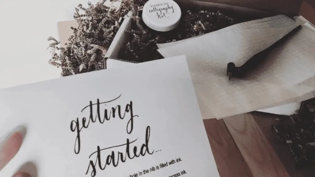
This tutorial, and calligraphy as a whole, requires specific tools and materials. If you don’t have them, no worries – just head over to New Hobby Box’s buyer’s guide to calligraphy. I wrote the buyer’s guide for beginner’s – saving you the headache of paying too much for cheap products.
In this tutorial, you’ll learn eight foundational calligraphy strokes, applying those strokes to the alphabet, and finally testing out calligraphy by recreating some of my favorite books and movies.
Calligraphy is beautiful, and beauty is hard work. So find a cozy seat, put some tea on the kettle, and throw your phone on silent – or whatever helps get your creative juices flowing.
THINGS TO NOTE BEFORE WRITING CALLIGRAPHY
You should read this section in full. Trust me on this…
I owned a light-colored wooden dining room table (in the photo below – pre-ink stains) with ink stains to prove the value of reading this section in full.
We’ll look at setting up your writing station, how to set up and hold your oblique pen, some basic calligraphy strokes, and some writing tips I wish I knew before my first session.
Setting Up A Writing Station
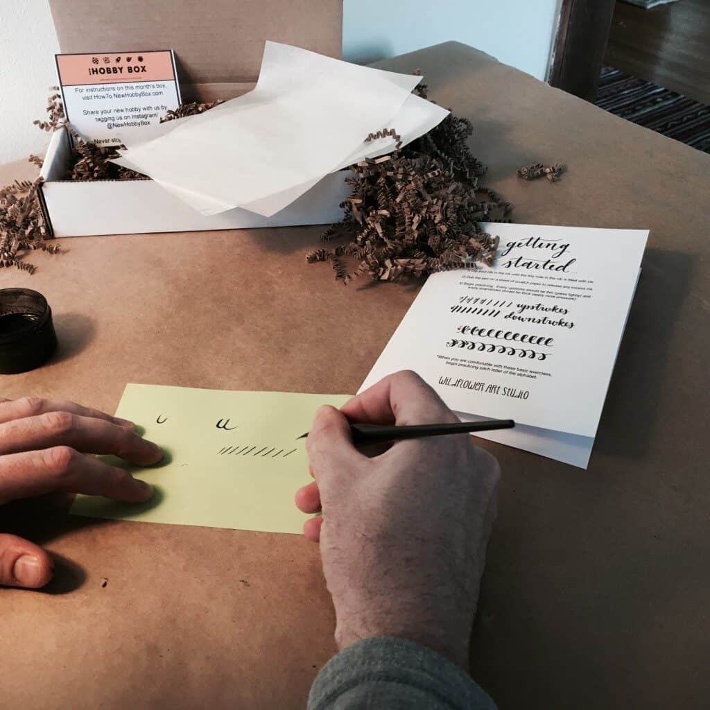
First things first, you need to find a well-lit, flat surface.
This is going to be your calligraphy oasis so take a minute to clear off an appropriate spot. And this may go without saying, but this is potent ink.
The ink will stain anything it comes in contact with; I would highly recommend laying down a barrier between your surface and your work. You may want to wear some old clothes as well.
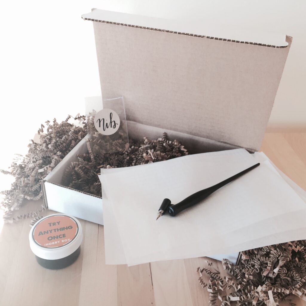
WHAT YOU’LL NEED AT YOUR STATION:
- A stack of tracing paper
- A few sheets of grid paper
- Your oblique pen and nibs
- Your ink
- A glass of water (more on this later)
- Optional: a small dish for your nibs
- Any templates or books you might be using
Lights on and table clear? Have all your supplies and tools in arm’s reach? Cool, it’s time to set up your oblique pen.
How an Oblique Pen for Calligraphy Works
We’ve mentioned the oblique pen quite a bit so far, but for the uninitiated, an oblique pen is a pen that has a slanted nib. The slanted nib makes it easier to write in a straight line because you can hold the pen at a consistent angle.
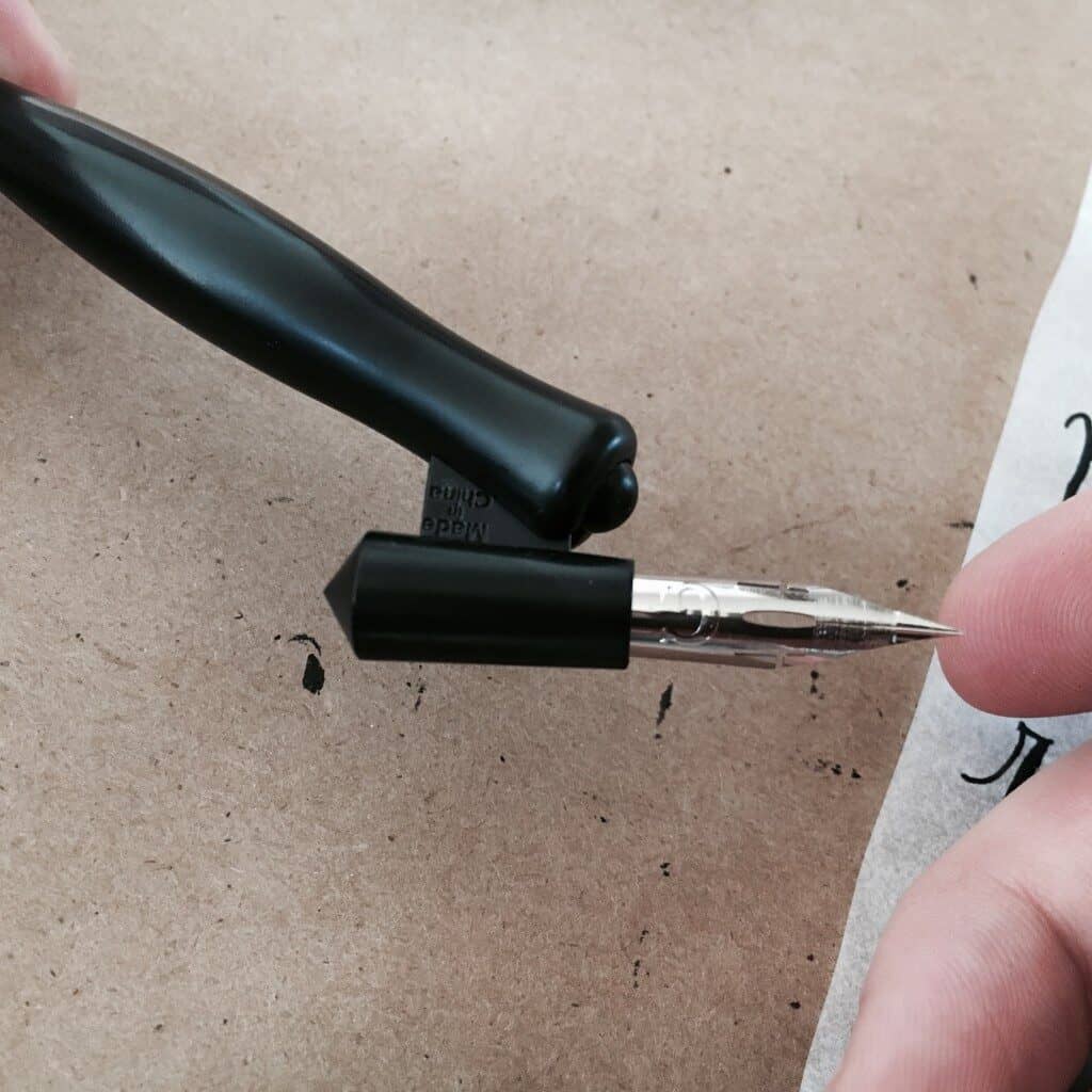
There are three general components of an oblique pen – the nib holder, the flange, and of course, the nib.
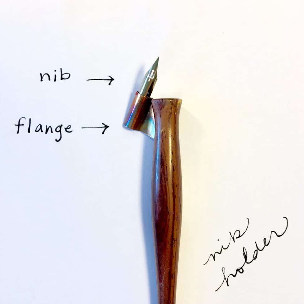
WHAT IS A CALLIGRAPHY FLANGE?
The flange is the metal piece (or plastic in our case) that holds the nib in place. On premium calligraphy pens, you’ll find a small screw that allows you to tighten or loosen the nib in the flange. And finally, it’s what you grip when you’re writing.
The holder is the wood (or plastic) part of the pen – it’s where the flange attaches.
Some oblique pens will have an adjustable holder – this allows you to customize the angle of the nib for your writing style. If you find yourself having trouble with consistency in your line width, adjusting the holder might be a solution.
ANATOMY OF A CALLIGRAPHY NIB
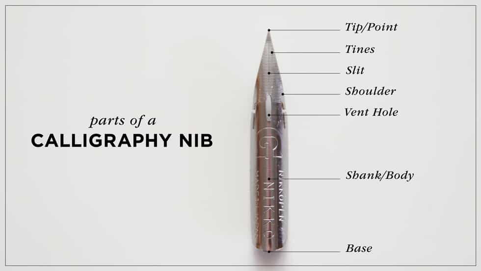
The calligraphy nib is the heart of your pen, and can be a finicky component for beginners: and for such a small thing it has quite a few elements to it, each with its own title.
- Base: Where the ink sits and flows onto the paper.
- Shank: Attaches to the penholder and holds the nib in place.
- Tines: Two metal prongs that come to a point at the nib’s edge. (These are what make contact with the paper and produce your line.)
- Vent Hole: Small hole drilled into the base of the nib – it allows air to enter the pen as you’re writing and prevents ink from clogging the nib.
“Why not just use a regular pen?”
Well, you could use a fountain pen – but the fountain pen ink wouldn’t flow as smoothly and it would be much harder to produce the beautiful strokes that define calligraphy.
I recommend using an oblique pen if you are just starting calligraphy.
HOW TO SET UP AN OBLIQUE PEN FOR CALLIGRAPHY
Setting up a basic oblique pen (like the basic plastic ones in our items list) is pretty simple and only requires a few steps.
1) WIPE YOUR NIB WITH A CLOTH
This removes any oil that comes on your nibs when you first open the package – you don’t want to fight an oil-in-ink battle.
2) INSERT THE NIB INTO THE FLANGE
You should feel a gentle click when you do this.
3) DIP THE NIB INTO THE INK UNTIL IT IS COVERED COMPLETELY
You want a decent amount of ink on the nib – but not so much that it’s dripping! Be careful not to get any ink on the flange or holder.
4) GENTLY SHAKE OFF EXCESS INK
You don’t want too much ink on the nib because it will make a mess and it will be harder to control your letters. You can use a brush if needed.
I told you it was simple.
Now that your pen is all set up, it’s time to learn how to hold it properly.
How to Hold an Oblique Calligraphy Pen
1) HOLD THE PEN AT A 45-DEGREE ANGLE
The goal is to keep the pen at a consistent angle – You’ll find that perfect angle with a bit of experimentation.
2) PLACE THUMB AND INDEX AT TOP OF PEN; MIDDLE FINGER UNDERNEATH
The key here is to find a nice balance between your thumb and index finger. Your middle finger should go at the bottom of the pen for support.
3) REST PINKY FINGER ON METAL FLANGE FOR STABILITY
Some people like to hold their pinky fingers in the air, but I find that it provides more stability if you rest it on the flange.
4) GRIP PEN LIGHTLY, DON’T PRESS NIB TO PAPER TOO HARD
You don’t want to death grip it because it will be harder to control your strokes. You don’t need to press down too hard – you’re going to let the nib glide across the paper and produce the strokes.
5) ADJUST GRIP AS NEEDED
Every hand is different, so you might need to adjust your grip as you write. Just make sure that the pen is at a 45-degree angle or at least close.
Well, would you look at the time…
It’s time to start writing!
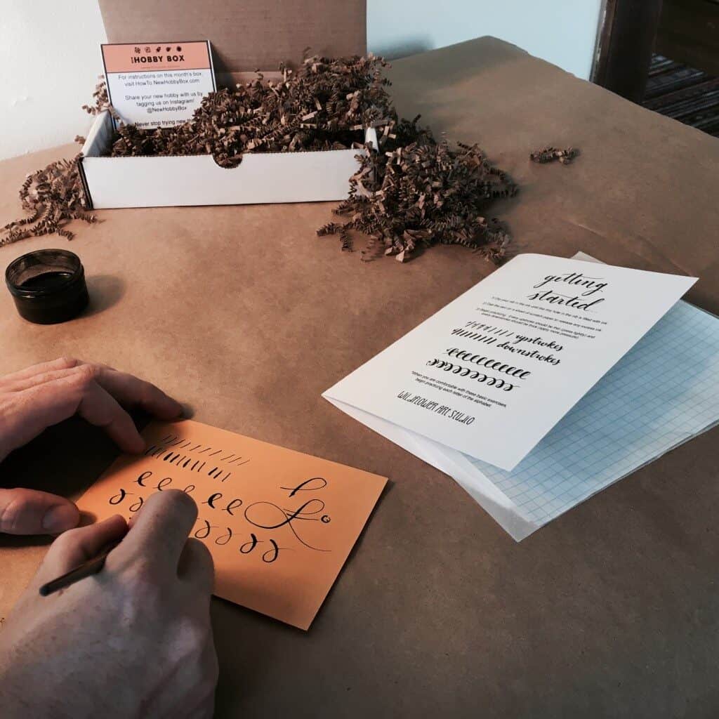
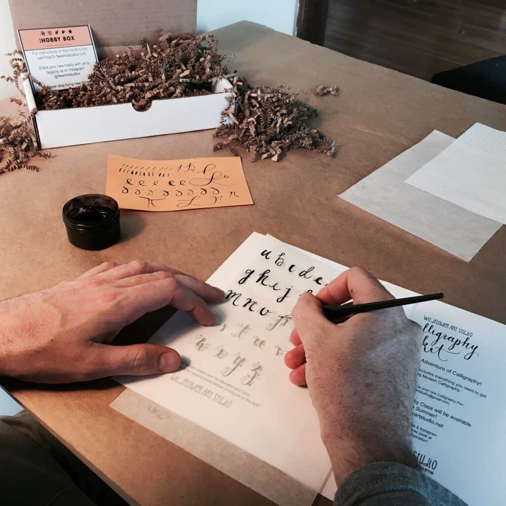
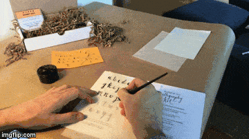
Ok – so you have your pen set up. You have the ink out. The time is now. Go ahead and pull a practice sheet of paper out. The orange card here in the image above is my practice sheet – aka an orange index card – this is an image from 2016 on my first attempt at calligraphy.
The goal is to just get comfortable with how the pen operates as we go through the next steps.
This is it… This is what you came here for.
HOW TO WRITE CALLIGRAPHY: 8 BASIC STROKES
There are 8 basic strokes that you need to know to write calligraphy.
The crew over at South Ranch Creative has a fantastic article with more detail on calligraphy strokes, I referenced them quite a bit in this section. Do yourself a favor and check them out.
Calligraphy Principles
A general principle that you need to remember when writing individual strokes is that down is thick and up is thin.
In other words, when the nib is pointing downwards, you will produce a thicker stroke and when the nib is pointing upwards, you will produce a thinner stroke.
The 8 Basic Strokes To Learn Calligraphy
1) DOWNSTROKE
The downstroke is the most basic of all the strokes and should apply heavier, but consistent pressure.
To start, either go straight down or move diagonally down from right to lower left.
On my first attempt at calligraphy, I had trouble holding the pen correctly while doing downstrokes.
If you wanted to do an upstroke, it’s simply the opposite of a downstroke – It’s simply going upward with lighter pressure to create a thinner line.
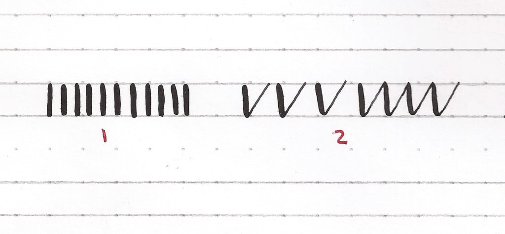
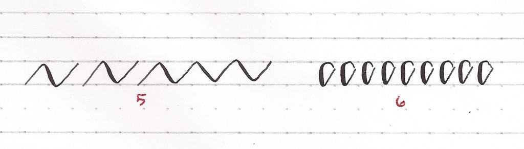
2) UNDERTURN
Think of a lower-cased “v” or “u” as the general shape. You’ll move left to right, applying heavier pressure going down. And as you transition to an upstroke, apply lighter pressure.
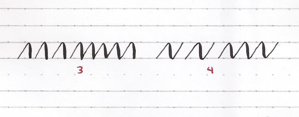
3) OVERTURN
Think of a lower-cased “n” as the final shape, except that it doesn’t have the ascender (left-side element on the letter “n” that goes above the arch.)
Move upwards with lighter pressure, at the peak of the overturn gently apply more pressure and begin your descent. Up thin, transition, down thick. All moving left to right.
It can be tricky because you need to apply more pressure at the beginning of the stroke so that it’s thick, and then lighten up as you move towards the end.
4) COMPOUND CURVES
This will be close to the shape of a capital “N” – moving left to right, you’ll go up, down, and up. Visually this will be thin, to thick, and back to thin again.
The compound curve can be rounded or sharp when you move from up to down – your choice.
5) EXPANDED COMPOUND CURVES
In this version, you’re looking to create a wider angle between your up and downward movements.
Additionally, practice your stroke weights – opting for thinner output and lighter pressure.
6) UPWARD LOOP
Vowels and lowercase letters love this motion. You will move right to left on this. Try to begin closer to the middle of the stroke.
Move up and left with a light stroke, then round it out.
Begin moving down with heavier pressure while curving back into the bottom – continue this motion up with a lighter stroke to where you started.
7) THE OVAL
The oval will put all of your skills to the test as it’s a looping stroke that starts with an upturn and closes with a downturn.
Start in a similar position to the upward loop (middle).
Watch your line weight and where you are trying to end the loop.
Don’t get frustrated, this is easily the most difficult stroke, but also where I started to have the “aha” moments of how to write calligraphy.
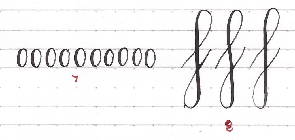
8) UPWARD AND DOWNWARD LOOPS
South Ranch Creative believes this is the most challenging of the eight strokes.
Regardless, start in a middle left position. You’ll start with an upward loop – so apply light pressure going up (moving left to right.) Round off the top while moving back to the left – transition your weight to heavier here.
Begin your descent with a heavier downstroke that begins the downward loop – which is moving left to right, and down to up.
You’ll keep that heavier weight until you begin to round off the bottom of the stroke and move the pen right to left, transitioning to lighter pressure, and finishing with a lighter weight upward stroke.
That was a lot – but master those and you will have mastered calligraphy.
It becomes a puzzle navigating all the variables – thicker and thinner, up and down, left and right…
I would recommend doing these strokes until you feel like you have a basic understanding of pressure and weight.
Let’s test your new skills out.
HOW TO WRITE CALLIGRAPHY LETTERS
The strokes were the crux of this how-to, but I wanted to show you how you could apply those individual strokes to writing letters.
Calligraphy: Letters of the Alphabet
If you haven’t printed off any of the hand lettering templates, now’s a good time – here’s the link again.
Grab your vellum sheet (or whatever translucent paper you landed on) and lay it on top of the alphabet.
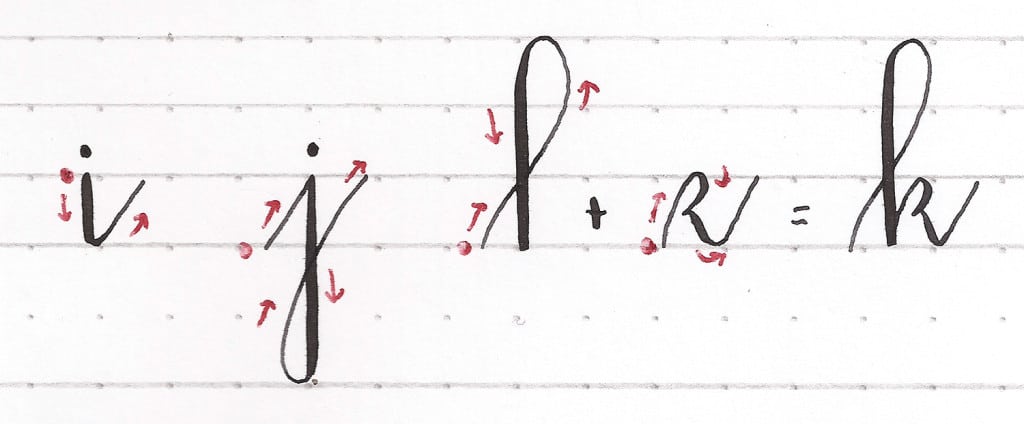
On the first pass, it might be helpful to draw small arrows showing the direction that your strokes need to go, then try lettering afterward.
I find oblique pens more forgiving than other pens, but if you mess up, just keep going then come back later to perfect the style.
I’m by no means amazing at calligraphy – just a guy who enjoys the art of writing. So, sure, my strokes are not perfect. But I do it because it’s fun and something I can work on.
The lettering that you trace is simply there as a reference, a guide of sorts. Your hand lettering doesn’t have to be exactly like the template – make your own rules.
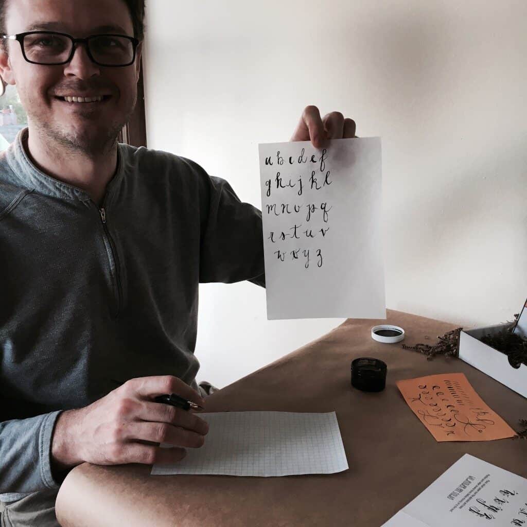
I was proud of my first alphabet – and it opened my eyes to my next calligraphy project…
Calligraphy: Lettering Book Titles
I thought of doing a birthday card for my mom, I also thought I might write New Hobby Box in calligraphy lettering, but I decided to move into something I love.
So, I recreated a few of my favorite book titles in calligraphy.
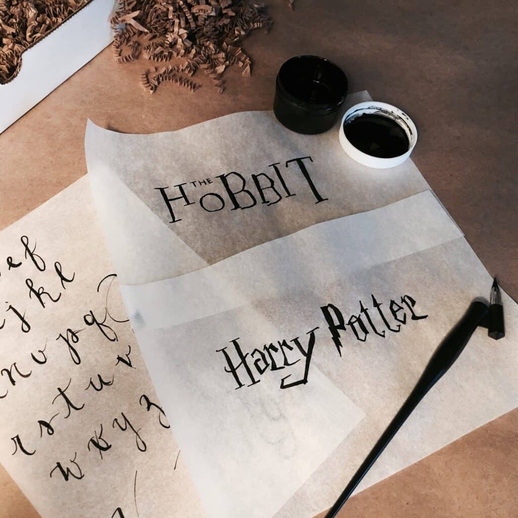
I first started with Harry Potter, because I’m a superfan and the font is iconic. The bolt in “Potter” was challenging because it’s not so much calligraphy, but a drawing. I kept going out of the lines, so I just adopted a version I liked and made it my own.
I next tried the Hobbit – it’s a bit off (that’s kindly put), but the book titles were my favorite ones the first time around.
I’d like to one day have a version that I can frame – but most of the calligraphy I do now is for holiday cards, which is always a big win with the family.
With cards, half of the battle is finding calligraphy styles you like and trying to emulate them. Don’t underestimate the power of a Google search when it comes to learning a style. There are thousands of styles to choose from.
TIPS FOR HOW TO WRITE CALLIGRAPHY
Ok, so where do you go from here? Up to you. But if you want to move past the strokes, alphabet, and titles, the world’s your oyster. Below, you’ll find some pro tips as well as amazing resources.
Pro Tips to Improve Your Calligraphy
1) MIND THE NIB
You know how when you do something and you get in the groove, you sort of forget the mechanics of what you’re doing? Don’t do that.
I dropped the nib into the ink about 5 times on my first attempt – I’m sure my whole neighborhood knew when it was happening due to the string of profanity that followed.
Every time you need more ink, be mindful of the nib as it relates to the quill. If it doesn’t look like it’s positioned at where it started, slide the nib back into its original place.
2) INK OFTEN
I remember when I first started, I thought I only needed to add ink once a minute at the most – I blame Hollywood portrayals of calligraphy.
But as I started to get the swing of things, it became apparent that nearly every few strokes needed a reapplication of ink or at least a solid flow in my well.
3) YOU CAN USE WATER, BUT SPARINGLY
If your consistency of ink is off – too thick or just not flowing correctly, you can dilute it with water. But just a few drops.
Thin ink will cause your strokes to appear broken. And no one wants that – especially not when you’re starting out. And only dip the nib into the water, never the pen.
4) “G’S” UP
When you set up the nib, make sure the size mark on your actual nib is facing up. This will prevent it from slipping.
For the nib I used in this tutorial, that letter was “G.”
WRITING CALLIGRAPHY INSPIRATION
Between YouTube videos, Pinterest, and Google, you can learn so much about calligraphy. Here are a few of my favorites, in addition to what I’ve already linked to in this article.
- Fantastic explanation of writing capitalized letters. It made me get the effortlessness of a good motion.
- Open Ink Stand solid library of 101 classes, but I really just watched her videos to see how she writes. She’s got a gift and lots of videos too.
- If you liked the book title idea, check this out. Holy Moley, this person is crazy talented.
I know that was a long one – but calligraphy is special and I didn’t want to shortchange it.
If you have found other sources, go ahead and drop them in the comments and we can add them to this list. And of course share your calligraphy lettering skills with us in the comments or tag us on Instagram (@newhobbybox).
As always, thanks for making me a part of your hobby journey.
Happy Hobbying